Canada's History on your doorstep
Discover a wealth of interesting, entertaining and informative stories in each issue, delivered to you six times per year.

Discover a wealth of interesting, entertaining and informative stories in each issue, delivered to you six times per year.
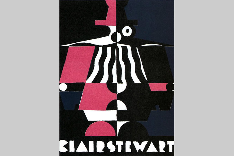
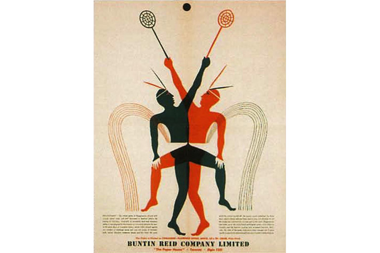


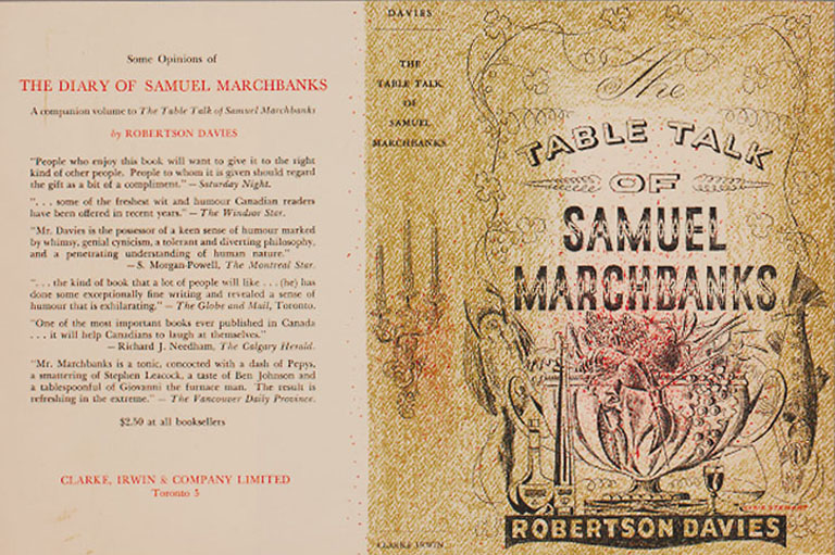

You probably haven’t heard of Clair Stewart, but you definitely know his work. As a graphic designer and founder of the design firm behind the logos for companies ranging from Air Canada and CTV to the Montreal Expos and Laura Secord, Stewart probably did more to shape Canada’s visual landscape than any other individual in the nation’s history. From the start of his career in the 1930s, Stewart was a man with a clear mission. First, he was dedicated to modernist graphic design—the school of design that drew inspiration from modern art movements. Second, he was committed to the idea that Canada should develop its own design industry, rather than rely on work imported from the United States and other countries. His relentless pursuit of these goals over five decades helped revolutionize Canadian graphic design.
Born in the tiny town of Kenton, Manitoba, in 1910, the son of the Reverend Dr. R.G. Stewart, a Presbyterian minister, and Lena M. Stewart (née Johnston), Stewart and his family lived in Vancouver, Victoria, and Edmonton before settling in Belleville, Ontario, when he was in his teens. Stewart recalls that he was always interested in art, and, as high school graduation approached in 1928, he declared his intention to pursue a career as a graphic designer (or, in the terminology ol the day, commercial artist). A career in the arts was practically unheard of in Canada during this period, and the field of commercial art seemed particularly unlikely and unstable. But Stewart was determined, and, over the objections of his father, who had hoped his son would follow him into the ministry, he enrolled at the Ontario College of Art in Toronto.
Stewart arrived at the College at an exciting time. By the late 1920s, several members of the legendary Group of Seven, who had tirelessly championed their vision of a distinctive and modern Canadian art since their first show in 1920, had colonized the institution. One of the most eloquent members of the Group, J.E.H. MacDonald, was principal, three other members of the Seven had recently taught at the school, and another, Franklin Carmichael, joined the faculty while Stewart was enrolled.
Stewart flourished at art school, encouraged by the faculty’s respect for commercial design and its openness to modern art. Immersing himself in European commercial art journals, he became a devotee of avant-garde British and French design, which had been rapidly developing since the war. Traditional commercial art since the nineteenth century had followed a formula whereby a realistic illustration, often narrative or sentimental in theme, was paired with text in a symmetrical arrangement, each isolated from the other. In the 1920s, modern designers such as Edward McKnight Kauffer and A.M. Cassandre—who worked in England and France, respectively, and were two of Stewart’s favourites—were at the forefront of efforts to adapt elements of European modern art to create a new visual language. Instead of realistic illustration, modern designers used simplified, stylized forms and symbols—often inspired by the work of artists like Picasso, Matisse, and Miró—to convey the essence of the subject mailer. And instead of strictly separating areas of image and text, modernists integrated the two into a dynamic continuum, often in witty ways.
While at the college, Stewart also absorbed his professors’ patriotic call for a uniquely Canadian art and design, but his plan to contribute to this mission was put on hold after his 1932 graduation. To his dismay, Stewart discovered that there were few opportunities in Toronto for a commercial artist. While there were a handful of jobs with engraving and printing firms, there was no such thing as a firm dedicated solely to graphic design. Stewart’s solution, like that of many Canadian artists before him, was to relocate temporarily to England. The profession in London was highly developed and offered the prospect of working with designers who were at the forefront of the field.
In Britain, Stewart obtained a junior position at Askew Young, a leading commercial art studio. The firm employed about twenty-five people in offices located on the top storey of the highest building in London, Halifax House. Stewart was made assistant to the creative head of the firm, developing ideas into preliminary sketches that could then be presented to clients by the firm’s sales staff.
Over the next three years, he received invaluable exposure to modern graphic design practices and techniques. In 1935, however, he returned to Toronto, his primary motivation being to reunite with Amy McLean, whom he had met while the two were still in their late teens. They married in 1937 (and would eventually raise a family of six children).

Sign up for any of our newsletters and be eligible to win one of many book prizes available.
Back in the commercial art world of Toronto, Stewart found that little had changed since his college graduation. The Canadian design world remained small. Many important Canadian advertisers and publishers purchased art wholesale from American firms, forcing Canadian designers to continue to emigrate to countries with more opportunities. And the little work that was being produced in Canada was generally inspired by conservative American commercial art, which was slow to embrace the principles of modern European design. Critics in Canadian Art, writing just before and after the war, decried this state of affairs: Canadian design was “laborious” and “graphically antiquated,” with “nothing at all” to distinguish it from the most conventional American work.
Fortunately, Stewart was able to find a niche at a firm that was anxious to explore new approaches. The owners of McLaren and McCall, a small Toronto advertising agency, were intrigued by modern design and hired Stewart to head their art department. Over the next few years here, Stewart developed an aggressive approach, cold-calling potential clients and trying to sell his services. His work from this period, for companies including Imperial Oil and Birk’s Jewellers, is among the most avant-garde Canadian design of the 1930s.
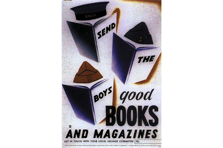
Stewart’s progress at McLaren and McCall was cut short by the advent of World War II, which found him heading a camouflage unit in British Columbia and then training as a pilot in Ontario. His design during this period was limited to a few war posters for the federal government. With the war’s end, however, Stewart finally found himself in a position from which he would be able to reshape the Canadian graphic design field. In 1945 he accepted a job as art director at Rolph Clark Stone Ltd., the largest printing firm in Canada, with plants in Toronto, Halifax, and Montreal. In contrast with other designers, most of whom worked freelance or at small studios, Stewart would now be supervising the design of vast quantities of printed material—advertising, packaging, calendars, menus, stationery, brochures, posters, and billboards—for Canada’s largest companies, destined for distribution across the nation.
Because the firm’s clients had traditionally been paying for printing and Rolph Clark Stone had essentially thrown in the design work for free, Stewart found that most of them paid little attention to design and designers. Nor did they understand what good design could mean for business.
Stewart immediately began overhauling and expanding the duties of the design department. First, he set out to establish the department as the main contact with the clients. “No one had made an effort to educate [clients],” Stewart recalls, and he confidently set out to do so. As a result, as he had done earlier at McLaren and McCall, Stewart found himself adding a sales dimension to his job. But instead of feeling frustrated by this situation, he found it invigorating, viewing it as a huge opportunity. “In what other country of equal size and importance,” he asked, “is there such a growing, almost demanding need for good advertising design?”
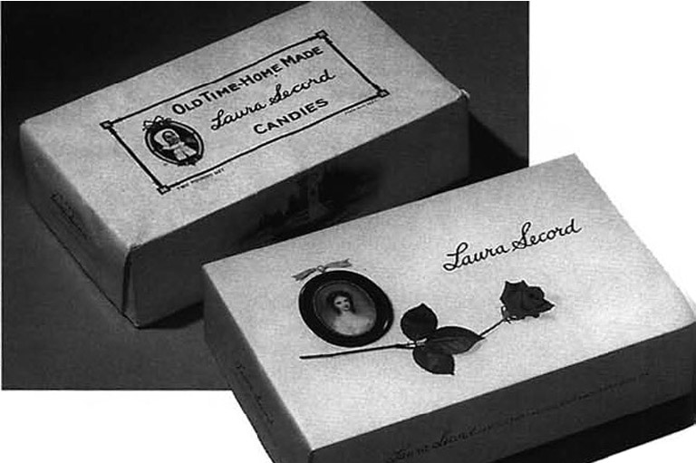
Among Stewart’s first projects were labels for the Canadian wine industry. Approaching the president of one winery, Stewart explained “that his labels could look as good as the labels on imported wine.” Within a few years, he and his staff were designing almost all of the wine labels in Canada. Another early target was Laura Secord, the national candy company: “I remember saying to the president of Laura Secord, ‘I probably shouldn’t say this, but your packages are awful.’ He said, ‘Well, then you tell me what to do.’” Until this point, Stewart felt, the company’s packages had been drab and old-fashioned. Stewart designed a more spare, delicate-looking package in white and sky blue and added his painting of a young woman in early-nineteenth-century costume. The new packaging was awarded a medal by the Art Directors’ Club of Toronto in 1952, and the company remains dedicated to a variation on his design to the present day.
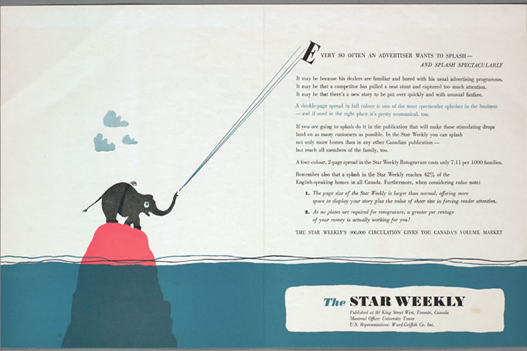
His successes soon convinced Stewart’s employers at Rolph Clark Stone to give him full backing; as Stewart puts it, they “started to see the light.” Stewart hired approximately twenty designers, and over the next fifteen years, he and his crew created work for some of Canada’s biggest companies, including Canada Packers (Maple Leaf foods, etc.), Canada Steamship Lines, the CNE, the Ontario government, Salada, and the Toronto Star.
During this period, Stewart also spearheaded efforts to organize the graphic design profession in Canada. In 1948, he and a handful of other designers founded the Art Directors’ Club of Toronto, modelling it after the professional organization for designers in New York. According to design historians, the club marked “an important step in the development of the design and advertising trades in Canada,” successfully “awakening a public and professional awareness of quality in advertising in all its forms.” The first organization of its kind in the nation, similar clubs soon sprang up in Montreal, Vancouver, and Winnipeg. Renamed the Advertising and Design Club of Canada in 1992, it has continued its activities without interruption to the present day.
Save as much as 52% off the cover price! 6 issues per year as low as $29.95. Available in print and digital.
Meanwhile, many of Stewart’s ambitions for Canadian design were being realized. In 1954, Graphis, one of the premier international design journals, featured an article on Canada and, citing Stewart’s work, declared that “great strides had been made” in Canadian graphic art. In 1960, the up-and-coming designer Theo Dimson reported that “the graphic designer, as an important creative communicator, is receiving greater acceptance in Canada today than ever before.” This “present progressive state” of affairs, he continued, was the result of “a small group of enlightened men and women who during the 1930s rebelled against the confused, uninspired approach to graphic design” and “struggled to bring creativity, clarity and order to graphic problems.” These men and women, with Stewart prominent among them, had been “very successful in their revolt.”
By this time Stewart was looking ahead to the next step in the evolution of the Canadian graphic design industry. With Ted Morrison, one of the senior designers in his department, he decided to leave Rolph Clark Stone and form a new company dedicated solely to design. It had become clear to Stewart that if Canadian designers wished to remain viable in the face of increasing American competition, they needed to operate such specialized firms. Stewart & Morrison was established in 1960 and is considered by design historian Robert Stacey to have been “arguably Canada’s first truly modern graphic design outfit.” Stewart served as president, Ted Morrison was vice-president, and a third partner, Rudy Eswarin, who had also worked at Rolph Clark Stone, soon joined them. Hans Kleefeld was made director of graphic design.
Although Stewart had initially expected the focus of the new firm to be packaging, the emphasis soon shifted to corporate identity programs—massive projects in which everything relating to a company, from business cards to the sides of delivery trucks, is given a new, consistent “look.” Such all-encompassing programs had been rare in North America until the mid-1950s, when the “ID business” started to become the fastest growing and most lucrative design specialty in the world. Stewart soon dedicated himself to convincing corporate Canada of the need to adopt corporate identity schemes. “Comparatively few Canadian companies have deliberately embarked upon a campaign to improve their corporate image—the face they present to the public,” he wrote in Canadian Art in 1962. Enhancing that image through the adoption of a sophisticated corporate identity program would “excite foreign buyers and create a real demand for Canadian-made goods.” And regardless of its commercial impact, Stewart argued, there were patriotic motivations to consider. The adoption of an orderly design program would bring “the broader satisfaction of having contributed to the corporate image of Canada as seen by the rest of the world.”
Canadian National Railways had taken the lead in corporate makeovers in Canada with the redesign of their logo and other graphics in 1959. The resulting visual program was unveiled with enormous publicity. Writing in 1962, Stewart declared it “so far the only significant attempt by a Canadian firm of any kind to establish a corporate identity which is other than dull, folksy or aggressively ugly.” In contrast, Stewart complained, the design program of another of Canada’s transportation giants, Air Canada, was so bad as to be “beyond description.” Executives at Air Canada must have been listening, for two years later they awarded Stewart & Morrison their first major corporate design account. The resulting identity program was a great success and helped to ensure a steady flow of clients.
By 1964, the company was already in a position to expand. Having “caught the attention of some of the U.S. corporate giants,” according to The Financial Post, Stewart and Morrison opened a New York office, making them the first Canadian design group to do so. Within the next few years Stewart and Morrison affiliated with a British firm, and in 1970 they created a London branch.
Through the 1960s and 1970s, Stewart and Morrison was Canada’s most prominent and prestigious graphic design firm. Their client roster came to include many of Canada’s biggest companies: Bank of Montreal, Toronto Dominion, Scotiabank, Seagram’s, and Canada Packers, among others. They designed the exhibits for the Ontario pavilions at Expo 67 and Expo 70. They created a slew of corporate identities for enterprises ranging from Catelli Pasta to the Montreal Expos. Many of these design schemes remain in use today, making Stewart & Morrison’s work a ubiquitous presence in Canadian life.
In 1981, Stewart sold his interest in Stewart & Morrison, and shortly afterwards he and Amy retired to their country home north of Toronto. Here, he has continued to paint and draw for his own pleasure. Although he is now physically removed from design circles, he is not forgotten. In 1998 he was awarded the Les Usherwood Award from the Advertising and Design Club of Canada, the highest award the graphic design industry in Canada can bestow. And in 2000 the Governor General awarded him the Order of Canada. Despite these honours, he remains humble to a fault—when interviewed about his life and work, he is liable to express discomfort at having to talk so much about himself.
Stewart admits that, bhack in his designing days, he encountered clients who rejected his ideas. However, he never let the opposition of such individuals and corporations discourage him. “If you’re on a crusade, that doesn’t matter much,” he explains. Thanks to this crusade, Canada boasts a proud history of sophisticated modern graphic design as well as a highly developed design industry that continues its activities to this day. Perhaps most importantly, Stewart’s efforts prevented Canada from being completely overrun with graphic design imported from abroad. Instead, many of the familiar signs, symbols, logos, and labels that constitute much of Canada’s visual culture are Canadian, and although we might generally take them for granted, they play a special role in making Canada distinct.
We hope you will help us continue to share fascinating stories about Canada’s past.
We highlight our nation’s diverse past by telling stories that illuminate the people, places, and events that unite us as Canadians, and by making those stories accessible to everyone through our free online content.
Canada’s History is a registered charity that depends on contributions from readers like you to share inspiring and informative stories with students and citizens of all ages — award-winning stories written by Canada’s top historians, authors, journalists, and history enthusiasts.
Any amount helps, or better yet, start a monthly donation today. Your support makes all the difference. Thank you!